ChallengeSizers (Capable)
maintainer: LionKimbro (jabber id: LionKimbro@jabber.org)
Abstract: Create a big mess of buttons on sizers.
Motivation: Sizers are ubiquitous to wxPython layout, especially development tools such as wxGlade and wxDesigner.
Resources:
UsingSizers (particuarly, big diagram near bottom of page)
Limitations:
2.4.1 wxWindows version of wxFlexGridSizer - no proportionate growable columns.
- Doesn't show how to use wxADJUST_MINSIZE.
- Details box sizers and static box sizers.
Challenge
Create a frame with a notebook inside.
- 3 Pages.
Use "SetSizeHints" to constrain the frame.
minimum: The best size (GetBestSize()) of page 1.
- maximum: Twice the minimum size.
All buttons respond to a click by telling its size in a dialog (wxMessageBox).
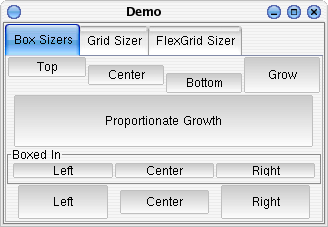
Page 1
Has:
- Four rows, all same size.
Except 2nd, which is 50% taller than the others.

1st Row:
- Holds 4 buttons, equal in width:
#1-#3 do not resize vertically.
- #1 hugs the top.
- #2 floats in the center.
- #3 hugs the bottom.
- #4 occupies as much vertical space as it can.
2nd Row:
- Has 1 button.
The button grows as much as it can, as long as it does so proportionately.
- The button should center horizontally when possible, and lean to the bottom.
3rd Row:
Fill this row with a sub-box- a wxStaticBoxSizer.
- Text should read: "Boxed In".
UsingSizers has a hint on using static box sizers.
- pack three boxes in: "Left", "Center", and "Right"
- equal in width
- growing to maximum height.
4th Row:
- Use spacers and borders, to create 3 buttons:
- (10 blanks) button (10 blanks) button (10 blanks).
- The middle button should have a border of 5 ALL around.
- The left and right buttons should have a border of 5 only on both of their sides.
- All bottons should occupy maximum vertical space.
Use the BestSize of page 1 to set the app's window's min/max sizes.
- All buttons should report their size in a dialog box.
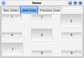
Page 2 Framing
This page features a single wxGridSizer.

Grid sizers perform only very simple layout. Their limitations can be made up for with nested sizers.
Make a 3x3 grid sizer.
- Horizontal spacing at 30,
- Vertical spacing at 2.
Fill with 9 buttons.
- Hugging their cardinal direction.
- For example, the top left hugs the top and left walls.
- Center button grows to fill allotment.
- Same with bottom-left and top-right.
- Yes, a diagonal stripe from bottom-left to top-right of filling buttons.
Try to make a button that fills horizontally, but not vertically, and vice versa. The layout controls for the grid sizer are not sophisticated. However, you can put a box sizer within a grid sizer cell, and get the behavior you want.
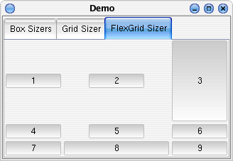
Page 3 Framing
This page features a single wxFlexGridSizer.

 This challenge assumes wxPython 2.4, which means you can't specify proportionate column/row lengths.
Make a 3x3 flex grid sizer.
- Horizontal spacing at 2,
- Vertical spacing at 2.
- The middle column should grow.
As should the top row.
Fill with 9 buttons.
- Centered.
- Except for the top-right button, and the middle bottom button.
Those two should fill.
Questions to Answer
Congratulations! You're done!
Here's something to ponder:
If:
- you were adding a button to a wxHORIZONTAL sizer,
And:
- button NOT shaped with wxSHAPE,
WHEN?
- ...could you possibly need wxALIGN_CENTER_HORIZONTAL?
consider: proportion=0, proportion>0
- does anything else, besides wxSHAPE adjust width of control (within the sizer's allocation of width)?
- does that thing (that adjusts width of control) leave any ambiguity of horizontal placement?
- thus, is there anything else besides wxSHAPE that could require the use of wxALIGN_CENTER_HORIZONTAL?
Comments
Questions for people who attempted the challenge:
- How long did it take to finish?
- What unreasonable problems did you confront in the challenge?
- How can this be improved?
- Anything else?
-- LionKimbro 2003-08-15 00:50:36
