wxSizer overview
Contents
Why sizers?
Sizers, as represented by the wxSizer class and its descendants in the wxWindows class hierarchy, have become the method of choice to define the layout of controls in dialogs in wxWidgets because of their ability to create visually appealing dialogs independent of the platform, taking into account the differences in size and style of the individual controls. Therefore, dialogs created with wxDesigner are based exclusively on sizers, practically forcing the user to create platform independent layouts without compromises.
The direct consequence of using sizers exclusively is that, contrary to what other dialog editors allow, it is not possible to drag any control (with the mouse) to the desired position or to specify any absolute position for the control, neither is it possible to specify a start-up size for any dialog, although this can be overridden if the controls in the dialog are allowed to grow or shrink.
This overview describes and shows what can be done with sizers, it does not give information on how this can be achieved. For information on how to use sizers in your programs refer to the wxWidgets help, for information on how to create sizer-based dialogs with wxDesigner, please read the wxDesigner overview that is part of this help system.
The idea behind sizers
The layout algorithm used by sizers in wxWidgets is closely related to layout systems in other GUI toolkits, such as Java's AWT, the GTK toolkit or the Qt toolkit. It is based upon the idea of individual subwindows reporting their minimal required size and their ability to get stretched if the size of the parent window has changed. This will most often mean that the programmer does not set the start-up size of a dialog, the dialog will rather be assigned a sizer and this sizer will be queried about the recommended size. This sizer in turn will query its children (which can be normal windows, empty space or other sizers) so that a hierarchy of sizers can be constructed. Note that wxSizer does not derive from wxWindow and thus does not interfere with tab ordering and requires very few resources compared to a real window on screen.
What makes sizers so well fitted for use in wxWidgets is the fact that every control reports its own minimal size and the algorithm can handle differences in font sizes or different window (dialog item) sizes on different platforms without problems. For example, if the standard font as well as the overall design of Linux/GTK widgets requires more space than on Windows, the initial dialog size will automatically be bigger on Linux/GTK than on Windows.
There are currently 5 different kinds of sizers available in wxWidgets. Each represents either a certain way to lay out dialog items in a dialog or it fulfils a special task such as wrapping a static box around a dialog item (or another sizer). These sizers will be discussed one by one in the text below. For more detailed information on how to use sizers programmatically, please refer to the wxWidgets help, available for download as well as online from the wxWidgets homepage.
Common features
All sizers are containers, i.e. they are used to lay out one dialog item (or several dialog items), which they contain. Such items are sometimes referred to as the children of the sizer. Independent of how the individual sizers lay out their children, all children have certain features in common:
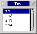
- A minimal size: This minimal size is usually identical to the initial size of the controls and may either be set explicitly in the wxSize field of the control constructor or may be calculated by wxWidgets, typically by setting the height and/or the width of the item to -1. Note that only some controls can calculate their size (such as a checkbox) whereas others (such as a listbox) don't have any natural width or height and thus require an explicit size. Some controls can calculate their height, but not their width (e.g. a single line text control):


- A border: The border is just empty space and is used to separate dialog items in a dialog. This border can either be all around, or at any combination of sides such as only above and below the control. The thickness of this border must be set explicitly, typically 5 points. The following samples show dialogs with only one dialog item (a button) and a border of 0, 5, and 10 pixels around the button:


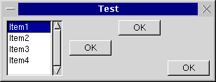
- An alignment: Often, a dialog item is given more space than its minimal size plus its border. Depending on what flags are used for the respective dialog item, the dialog item can be made to fill out the available space entirely, i.e. it will grow to a size larger than the minimal size, or it will be moved to either the centre of the available space or to either side of the space. The following sample shows a listbox and three buttons in a horizontal box sizer; one button is centred, one is aligned at the top, one is aligned at the bottom:

- A stretch factor: If a sizer contains more than one child and it is offered more space than its children and their borders need, the question arises how to distribute the surplus space among the children. For this purpose, a stretch factor may be assigned to each child, where the default value of 0 indicates that the child will not get more space than its requested minimum size. A value of more than zero is interpreted in relation to the sum of all stretch factors in the children of the respective sizer, i.e. if two children get a stretch factor of 1, they will get half the extra space each <i>independent of whether one control has a minimal sizer inferior to the other or not</i>. The following sample shows a dialog with three buttons, the first one has a stretch factor of 1 and thus gets stretched, whereas the other two buttons have a stretch factor of zero and keep their initial width:

Within wxDesigner, this stretch factor gets set from the Option menu.
wxBoxSizer
This sizer can lay out its children either vertically or horizontally, depending on what flag is being used in its constructor. When using a vertical sizer, each child can be centered, aligned to the right or aligned to the left. Correspondingly, when using a horizontal sizer, each child can be centered, aligned at the bottom or aligned at the top. The stretch factor described in the last paragraph is used for the main orientation, i.e. when using a horizontal box sizer, the stretch factor determines how much the child can be stretched horizontally. The following sample shows the same dialog as in the last sample, only the box sizer is a vertical box sizer now:

wxStaticBoxSizer
The same as a wxBoxSizer, but surrounded by a static box. Here is a sample:

wxGridSizer
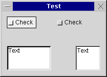
A two-dimensional sizer. All children are given the same size, which is the minimal size required by the biggest child, in this case the text control in the left bottom border. Either the number of columns or the number or rows is fixed and the grid sizer will grow in the respectively other orientation if new children are added:

wxFlexGridSizer
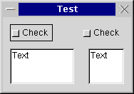
Another two-dimensional sizer derived from wxGridSizer. The width of each column and the height of each row are calculated individually according the minimal requirements from the respectively biggest child. Additionally, columns and rows can be declared to be stretchable if the sizer is assigned a size different from that which it requested. The following sample shows the same dialog as the one above, but using a flex grid sizer:

wxNotebookSizer
This specialized sizer can be used in connection with notebooks. It calculates the size of each notebook page and sets the size of the notebook to the size of the biggest page plus some extra space required for the notebook tabs and decorations.
