|
Size: 1605
Comment:
|
← Revision 18 as of 2011-03-26 02:41:17 ⇥
Size: 2033
Comment:
|
| Deletions are marked like this. | Additions are marked like this. |
| Line 1: | Line 1: |
| ##master-page:HelpTemplate ##master-date:Unknown-Date #format wiki #language en All associated wiki pages: |
|
| Line 8: | Line 13: |
| ------ = DRAFT -- DRAFT -- DRAFT = ------ |
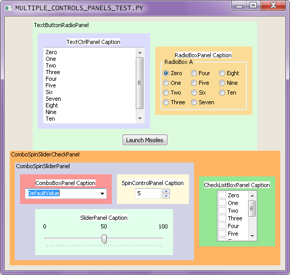
Here's a demo GUI that is built up from panels that contain multiple controls. Each panel is colored uniquely so that they are clearly differentiated from each other. Also, each panel was designed to have space borders on all edges of the panels so that controls from adjacent panels would be a bit separated from each other. In most real-world GUIs, the panels would have the same background color and the panels would not be labeled with their own class names. |
| Line 12: | Line 15: |
| Here's a demo GUI that is built up from panels that contain multiple controls. Each panel is colored uniquely so that they are easilt differentiated from each other. Also, each panel was designed to have spacing borders on all edges of the panels so that controls from adjacent panels would be a bit separated. In most real-world GUIs, the panels would have the same background color and the panels would not be labeled with their own class name.. | Each panel holding just a single control does not necessarily have to have a StaticText used as a label to identify the particular purpose of the associated control. Some controls like the RadioBox already have label functionality built into them. Buttons are naturally self-labeling and don't need to be contained within a panel at all. |
| Line 16: | Line 19: |
| . {{attachment:MultipleControlsPanels_Demo.PNG}} | . {{attachment:MultipleControlsPanels_Demo.png}} |
| Line 18: | Line 21: |
| [[attachment:MultipleControlsPanels_Demo.py]] [[attachment:PanelControls.py]] [[attachment:AddLinearSpacer.PY]] | . [[attachment:MultipleControlsPanels_Demo.py]] . [[attachment:PanelControls.py]] . [[attachment:AddSpacer.py]] |
All associated wiki pages:
BoxSizerFromTheGroundUp/NestedControlGroups |
||
Here's a demo GUI that is built up from panels that contain multiple controls. Each panel is colored uniquely so that they are clearly differentiated from each other. Also, each panel was designed to have space borders on all edges of the panels so that controls from adjacent panels would be a bit separated from each other. In most real-world GUIs, the panels would have the same background color and the panels would not be labeled with their own class names.
Each panel holding just a single control does not necessarily have to have a StaticText used as a label to identify the particular purpose of the associated control. Some controls like the RadioBox already have label functionality built into them. Buttons are naturally self-labeling and don't need to be contained within a panel at all.
Only BoxSizers are used to arrange everything, of course.
BoxSizerFromTheGroundUp/NestedControlGroups |
||

